When it comes to pool safety, a well-designed sign can mean the difference between clarity and chaos, between quick action and fatal hesitation. Unfortunately, most pool signs today are a convoluted mess—cluttered with excessive text, unclear symbols, and poorly chosen fonts that reduce legibility. This lack of functional design isn’t just an inconvenience; it’s a serious hazard.
As the designer behind poolsigns.com.au, I set out to change that. My goal was to create signage that wasn’t just aesthetically pleasing but also functionally superior—signs that people could absorb in an instant, even in a moment of crisis. Here’s how I approached the balance of form and function to design signs that are as effective as they are visually appealing.
1. Clarity Over Clutter
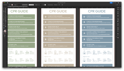
The biggest problem with most pool signs is the sheer amount of unnecessary information crammed onto them. When someone is in distress, they don’t have time to parse a wall of text. I stripped away the excess, ensuring that every word and every icon served a clear purpose. The result? Concise, instantly recognisable information that can be processed in a split second.
2. Typography Matters
Not all fonts are created equal, especially when it comes to emergency situations. Decorative fonts might look nice, but they can be difficult to read, especially from a distance or in bright sunlight. I chose bold, high-contrast, sans-serif typefaces that maximise readability at a glance. Every letterform was selected to ensure that critical instructions could be understood immediately, without the reader having to slow down.
3. Durable Materials for Long-Term Safety
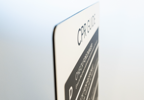
A pool sign isn’t just a decorative piece—it needs to withstand the elements. Sun, chlorine, saltwater, and constant exposure to moisture can degrade materials quickly, making signs unreadable just when they’re needed most. That’s why I prioritised UV-resistant, rust-proof materials that ensure longevity without fading, cracking, or peeling. A safety sign is only effective if it’s visible and intact when it matters.
4. Smart Use of Symbols and Colours
Beyond words, symbols play a crucial role in fast comprehension. Universal pictograms and high-contrast colour schemes allow for instant recognition, even for non-English speakers or children who may not yet be able to read. I focused on using intuitive iconography and bold colours to create visual hierarchy—red for warnings, blue for information, and yellow for caution. A great deal of thought went into the range of colours used, ensuring that they were both aesthetically pleasing and functionally effective. Each colour was selected to enhance visibility in different lighting conditions and pool environments.
5. Balancing Function and Aesthetics
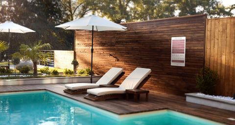
A well-designed sign doesn’t have to be ugly. Too often, designers sacrifice aesthetics in the name of functionality, but I wanted to prove that you can have both. The challenge was to create signs that fit beautifully into any poolside environment while remaining highly legible and informative. I designed with clean lines, modern typography, and a structured layout that enhances, rather than disrupts, the space around it.
6. Designing for Real-World Emergencies
Every design decision was made with a single question in mind: Will this sign help someone in a real emergency? From ensuring key information is at eye level to avoiding unnecessary complexity, every detail was refined to make these signs work when they’re needed most. Because in a moment of crisis, poor design can cost lives—and that’s a risk no one should take.
Elevating Pool Safety Through Design
At poolsigns.com.au, we’re redefining what safety signage should be: clear, durable, and effective, without compromising on style. By focusing on the principles of functional design, we’ve created pool signs that do more than just inform—they protect. Because when seconds count, a well-designed sign isn’t just helpful—it’s life-saving.
Let’s set a new standard for safety signage, where clarity, durability, and aesthetics work together seamlessly.