When it comes to pool safety, effective communication is everything. A well-designed pool sign does more than just provide information—it ensures that critical messages are seen, understood, and followed. Whether it's safety rules, depth markers, or warnings, visual clarity plays a crucial role in keeping swimmers safe.
The Key Elements of Clear Pool Signs
1. Bold, Readable Typography
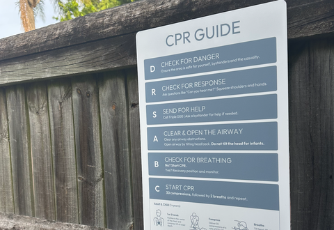
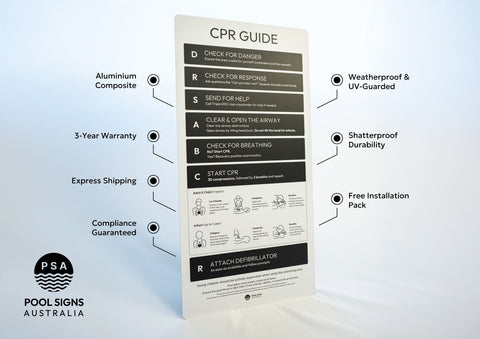
The most effective pool signs use strong, high-contrast typography to maximize readability. Simple, sans-serif fonts like Arial, Helvetica, and Verdana work best because they are easy to read from a distance and in varying lighting conditions. The font size should be large enough to be seen from across the pool deck, ensuring that critical safety messages aren’t missed.
2. Proper Use of Space
A cluttered sign is an ineffective sign. Adequate spacing between letters, words, and lines helps improve legibility. Overcrowded text or excessive graphic elements can create visual noise, making it harder for people to quickly grasp important information. White space, or negative space, enhances the overall readability and ensures that each message stands out.
3. High-Contrast Colours
Colour choice significantly impacts how easily a sign can be read. High-contrast combinations, such as black text on a white or yellow background, or white text on a red or blue background, improve visibility. Avoid low-contrast colour pairings like light grey on white, which can become unreadable in bright sunlight or low-light conditions.
4. Universal Symbols & Icons
Not everyone speaks the same language, and in public pool settings, international visitors may not understand written instructions. That’s why universally recognized symbols and pictograms are essential. A no-diving symbol, for instance, quickly conveys an important rule without the need for words.
5. Durable and Weather-Resistant Materials
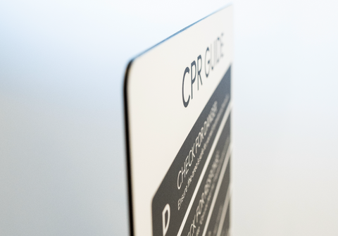
Pool environments are harsh, with constant exposure to water, chemicals, and UV rays. Signs made from high-quality, weather-resistant materials ensure that text and graphics remain clear and intact over time. Our range of durable pool signs are designed to withstand these conditions, providing long-lasting visual clarity.
6. Proper Placement for Maximum Visibility
Even the best-designed sign is useless if it's placed in the wrong spot. Signs should be positioned at eye level and near key areas where swimmers and visitors will naturally look—such as near entrances, changing areas, and directly around the pool deck. Visibility from multiple angles ensures that messages are seen before anyone enters the water.
Why Visual Clarity Saves Lives
Clear signage isn’t just about aesthetics; it’s about safety. In emergency situations, people need to process information instantly. A well-placed, highly legible sign can prevent accidents, ensure compliance with pool rules, and reduce liability risks for pool owners.
Upgrade Your Pool Signage Today
If your pool signs are faded, hard to read, or poorly designed, it’s time for an upgrade. Explore our full range of high-visibility pool signs to ensure your safety messages are clear, effective, and built to last.
Invest in readability, invest in safety.